Groupon
Groupon - Design System Refresh
A fresh, objective perspective on an ageing design system, assessed, untangled and rebuilt for scale.

- 1 System Replaced years of fractured libraries
- 4 Platforms iOS, Android, mobile & desktop web
- Playbook Governance for the whole design unit
- WCAG Accessibility applied across components
The Brief
Context
Groupon's design team was split across sectors that rarely talked to each other. Years of drift had left conflicting style guides, layout templates and component libraries with no single source of truth, which had inconsistency impacts across their product. I was brought in as an outsider with no predisposed bias, to fix it.
Read the detail
Responsibilities
- Refresh the design system and restructure its fractured component libraries.
- Establish governance the whole design unit would actually follow.
- Redesign the deal page (their primary point-of-sale funnel) with the new system.
The inconsistency compounded in two directions. Device-based differences meant iOS, Android, tablet, mobile web and desktop web had all drifted apart; geographically separated teams then multiplied that effect. As an external resource with no allegiance to any one team, my job was to analyse the conflicting libraries objectively and produce a standardised approach which designers could use when creating or updating components. Just as importantly, it meant getting teams collaborating who had spent years not doing so.
Discovery
Assessing a fractured system
Rather than lead with an opinion, I framed the audit as a testable assumption (that Groupon's design unit lacked single sources of truth at the product level), then went looking for evidence.
- Researched the conflicting Figma files, style guides and component libraries across every sector.
- Ran interviews and regular meetings to map their governance process, or lack of one.
- Synthesised the findings into an assessment document that drove the workshops that followed.
Read the detail
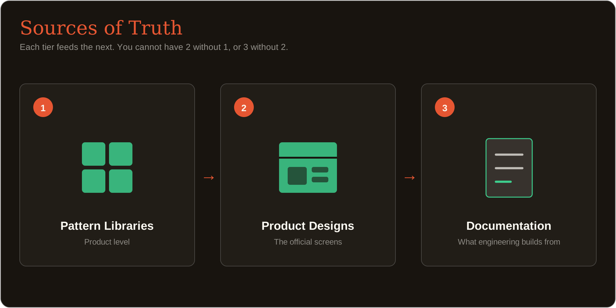
I defined shared vocabulary before presenting any findings: three types of "source of truth" that feed into each other, so every team contributed from the same definitions and data.
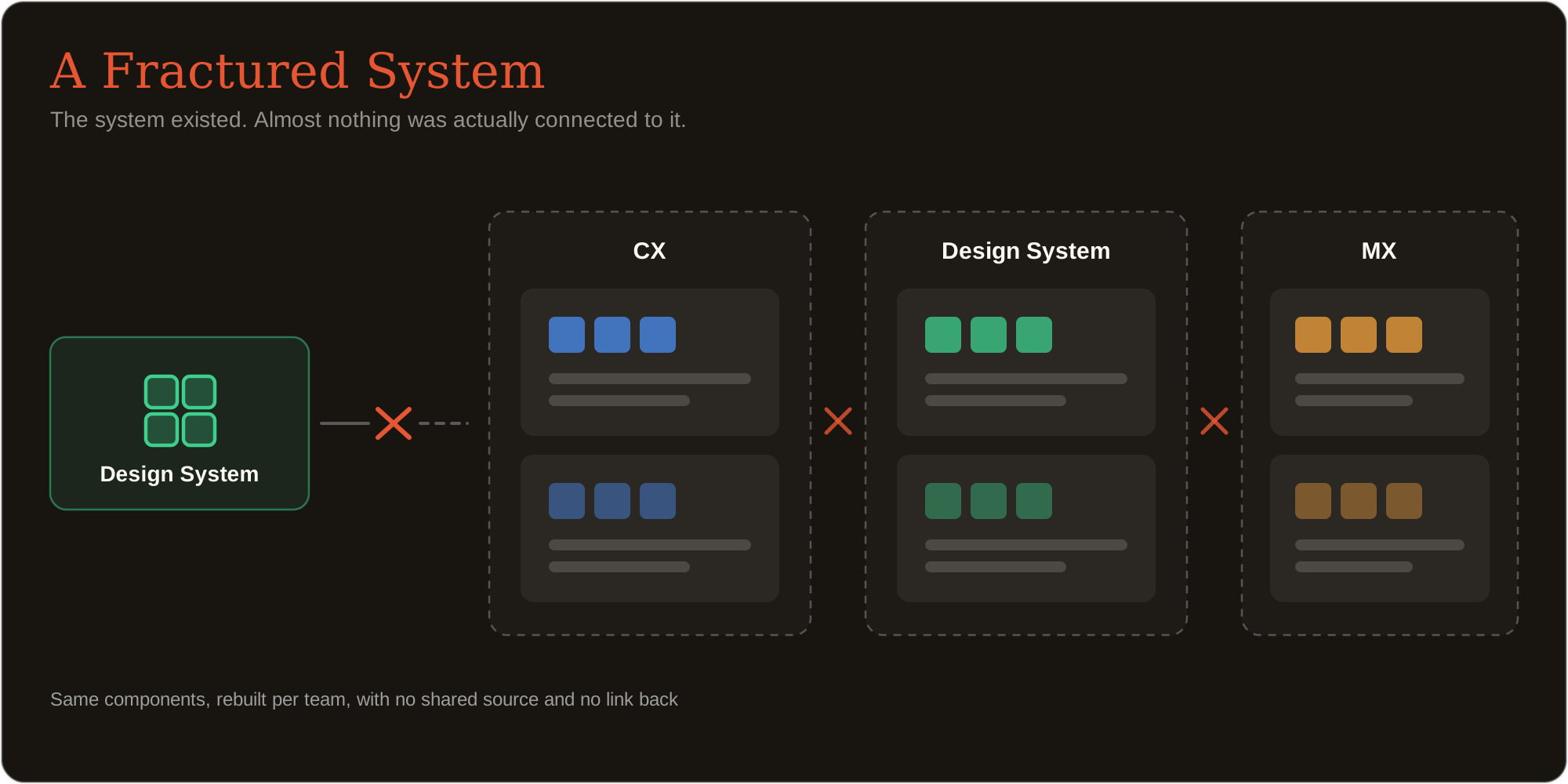
The evidence then grouped into three failure behaviours:
- No design-system syncing: product files ran on local, unofficial styles.
- Poor product-component management: old initiative files were serving as de-facto component libraries.
- Unsustainable practices: reusing old files for new initiatives, teams working in silos, and no governance model for approving new components.
Each pattern was paired with a root-cause analysis, so the recommendations that followed addressed the cause rather than the symptom.
Enablement
The solution
The assessment named the problems; the playbook answered them. I wrote it as a strict, followable guide, every rule traceable back to a finding from the audit.
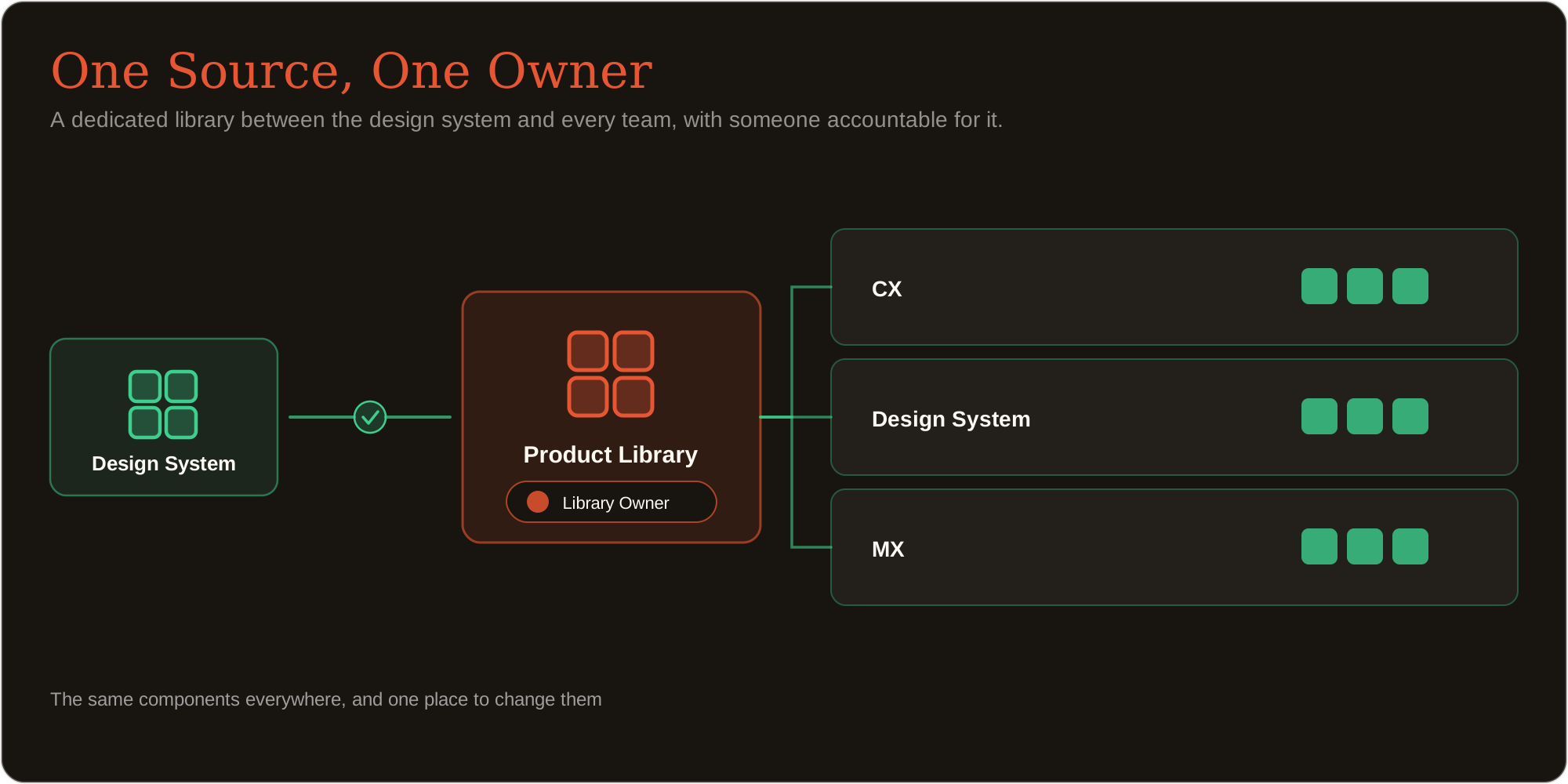
- Defined the governance model: dedicated product-level libraries, official source-of-truth files, and a named Product Library Owner.
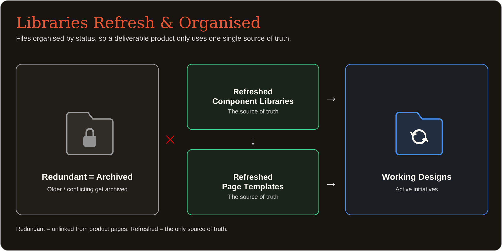
- Replaced the project-based file workflow with a status-based one, so the newest work is always findable.
- Documented a seven-step procedure for building and publishing a pattern library.
Read the detail
Every rule mapped onto something the audit had evidenced. Where there was no dedicated product-level library, the playbook defined one as the base layer for a source of truth. Where nobody owned components, it created governance models via a Product Library Owner role with explicit responsibilities: the library file itself, the contact point for additions, version control, and communicating updates back out to the team. The biggest shift was moving from a project-based file structure to a status-based one (Official Screens, In Progress, and Approved), so approved deliverables get reused and pushed to the live build rather than recreated and repurposed. The second half of the output is procedural, taking a designer from folder setup to a published library, so the standard was something people could execute rather than just agree with.
Revenue-critical UI
Proving it on the deal page
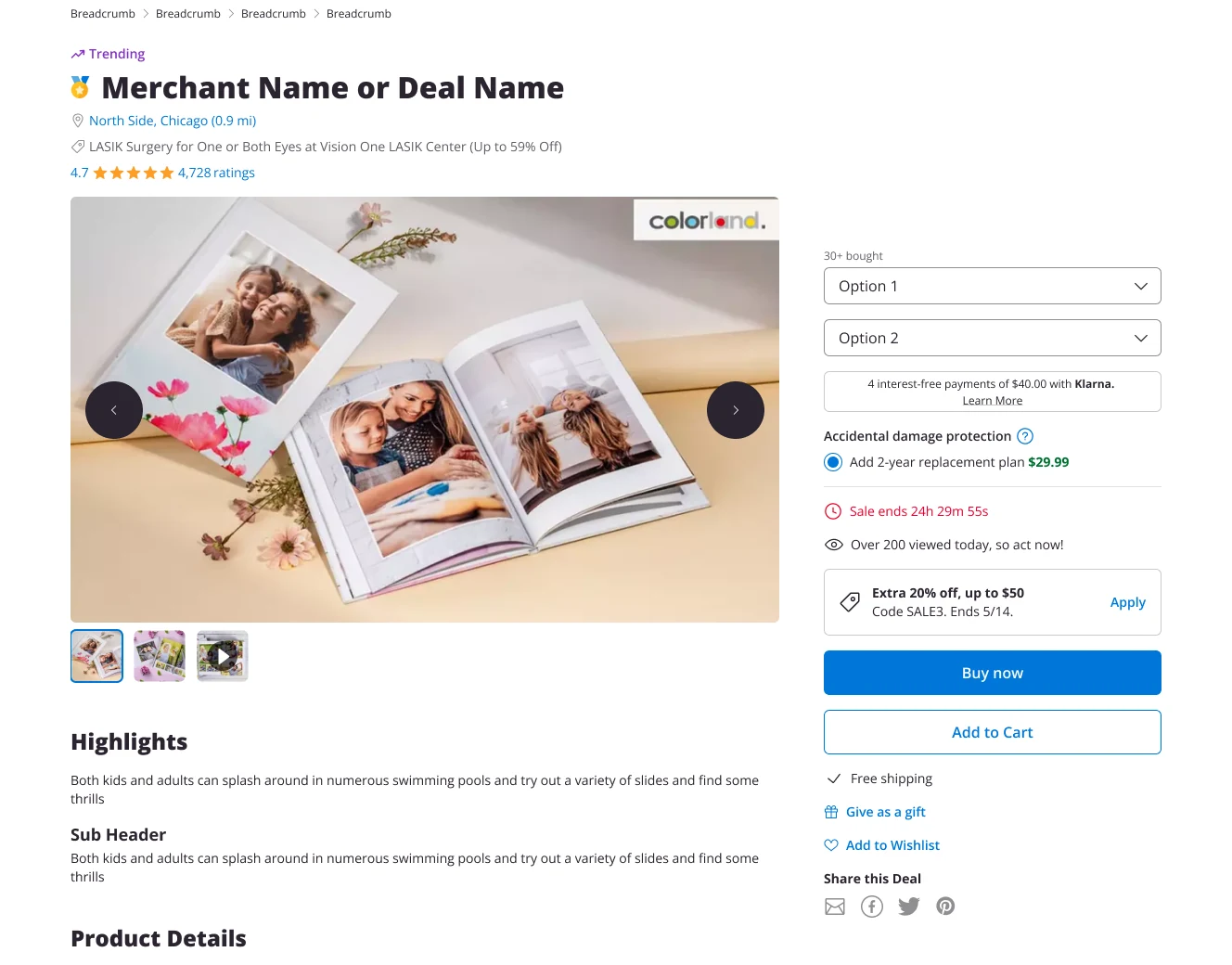
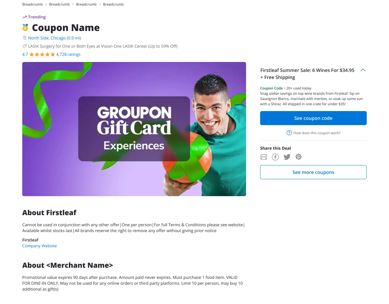
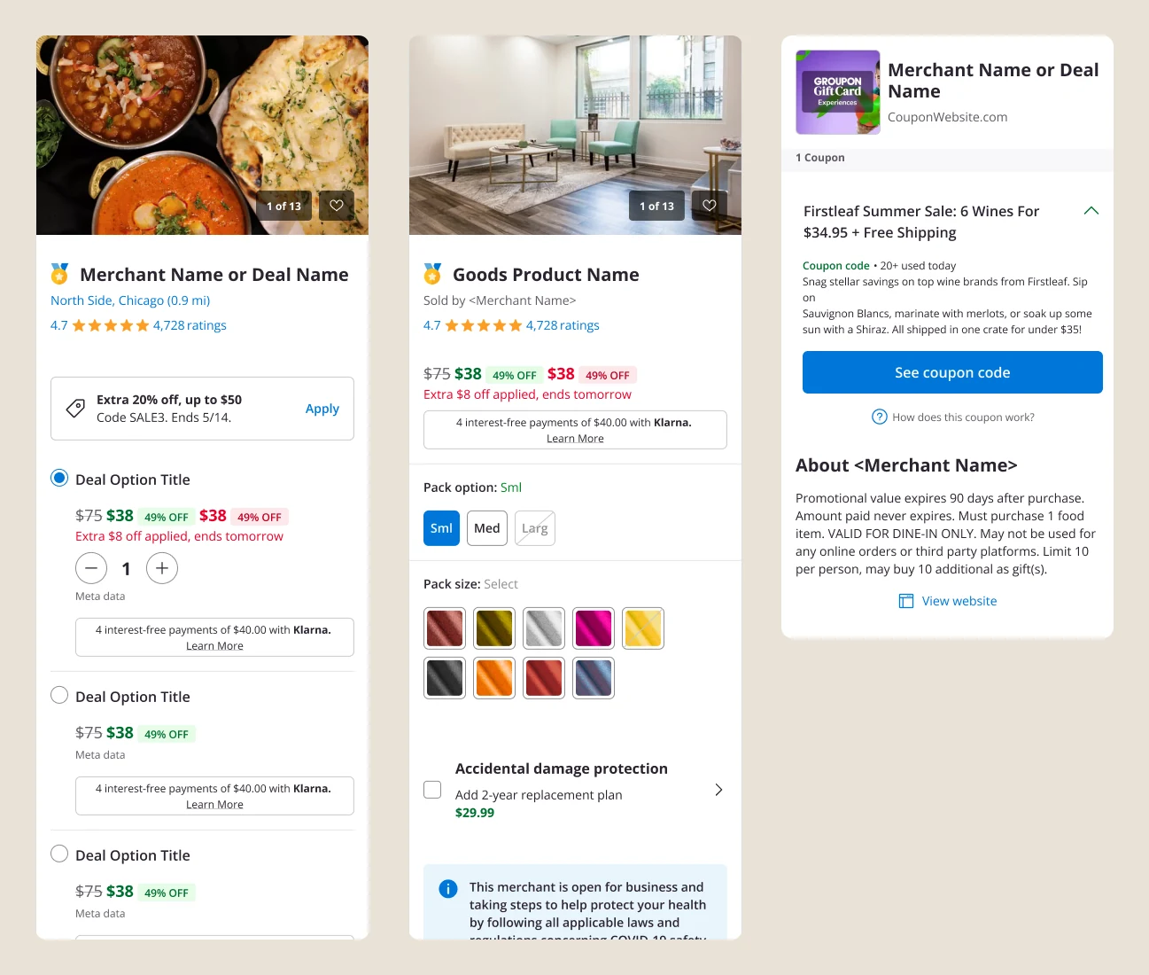
To future-proof the system I was then tasked with the redesign of the Deal Page (Groupon's primary point-of-sale funnel) in order to fully establish the end-to-end process for a real-world design workflow. One template, built from the new components, covering three deal types across four platforms.
- Unified Local, Goods and Coupon deals into a single reusable template.
- Redesigned it for desktop web, mobile web, Android and iOS.
- Ran competitor analysis to bring new patterns into the funnel.
Read the detail
A competitor analysis phase opened the work up, looking at platforms with comparable flows and features and folding the better patterns into the page. From there the redesign became a feedback loop: building a real, revenue-critical surface out of the new components exposed the gaps in them, which refined the system further. The result is a template rather than a page. The same body modules (hero carousel, highlights, reviews, merchant map) stack consistently across every deal type and platform, while the offer column adapts to what is actually being sold. That gave designers a worked example to build from, and gave me a concrete way to demonstrate the new system and its governance model to the wider design team.
Impact
Outcome
Groupon came away with a modern design system built for scale, the governance to keep it consistent, and a unified deal page proving it in production.
- Unified designers and teams around a clear vision.
- Produced a Playbook for governance and best practices, which acted as a strict guide for designers to follow, mitigating malpractices and enforcing set standards.
- Created a new and refreshed design system, which acts as a companywide source of truth, eliminating inconsistent patterns and components.
- Unified the deal page for all devices, categories and locations, providing a reusable template of page components designers could now use as a basis for consistency across all platforms.